July 2026
Kaeru UI harness
A case study on how Kaeru's interface gets designed: one page where every screen and state is mocked, reviewed, and promoted from design mockup to real component — before any of it ships.
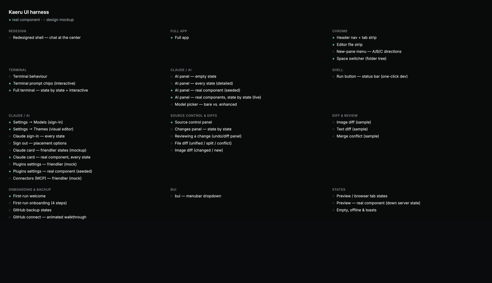
Designing inside a running app is slow and risky — you can't easily reach the empty state, the error toast, the merge-conflict view. So I pulled every surface out of the app and designed each state on its own.
Not a product — a look at how Kaeru's interface actually gets made. The harness is one page that holds every screen and state of the app at once: a filled dot means it's the real, shipped component; a hollow dot means it's still a design mockup. The whole UI, as a checklist of states.
Why a harness
Designing inside the running app is slow and risky. You can't easily get back to the empty state, the loading spinner, the offline toast, or the merge-conflict view — the exact moments that decide whether an interface feels considered or careless. The harness pulls each surface out of the app so I can design every state in isolation, see them all together, and promote a mockup to a real component only once it's right.
From git to plain language
The hardest part of Kaeru was making version control safe for people who aren't developers, and the harness is where that got solved — the Changes panel, iterated state by state. No commit / stage / push jargon: you describe what changed, tick what to save, and press one button that always names the next step (Save → Sync → Up to date). Anything that throws work away asks first; raw git hides under Advanced.
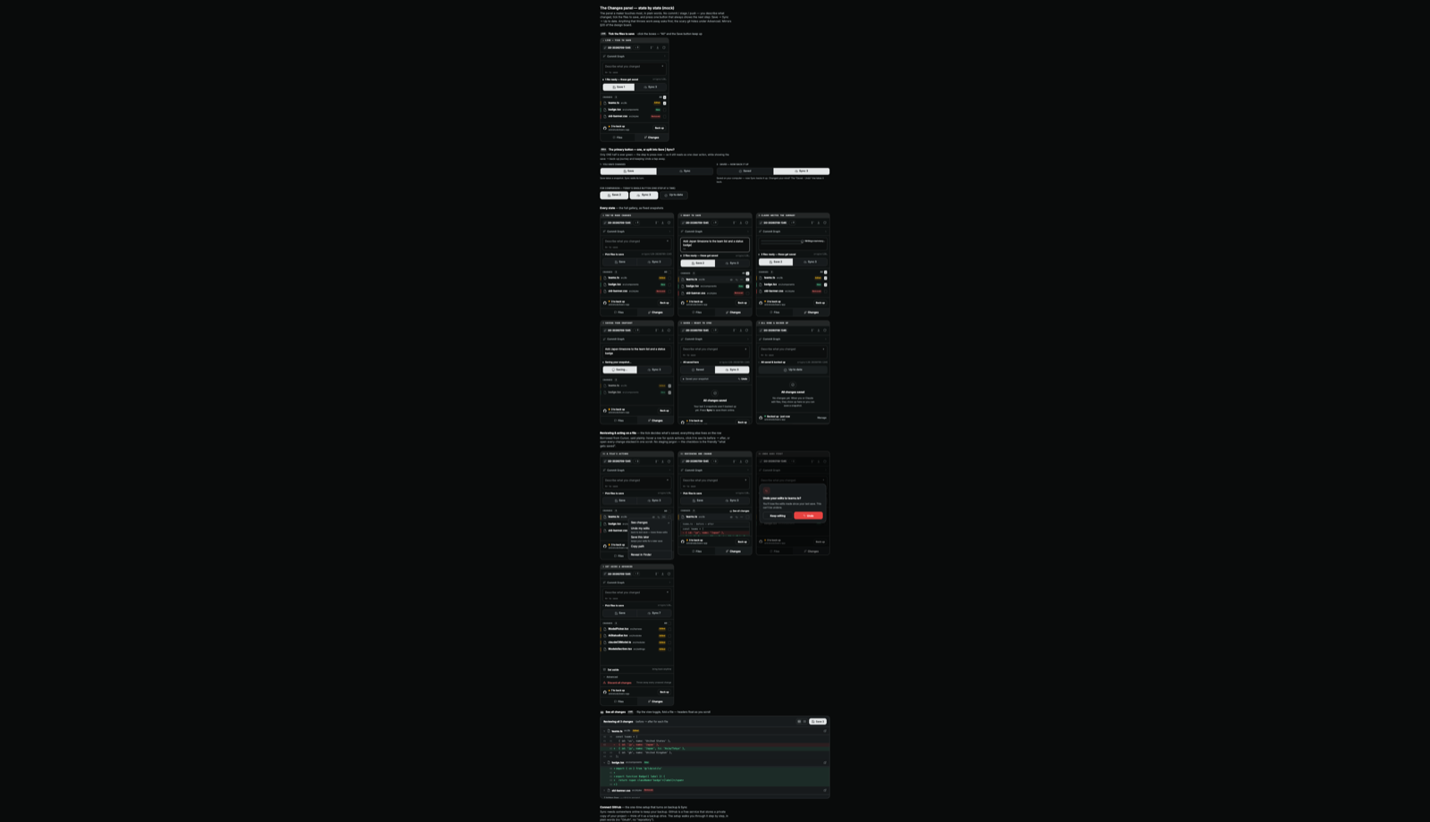
Each mock carries its reasoning next to it and cross-references the design board (e.g. "Mirrors §20"), so the why travels with the pixels instead of rotting in a doc no one reopens.
Mockup → real component
Every entry is tagged. A hollow dot is still a sketch; a filled dot is the shipped component rendered with seeded state. Because it's all the same page, I can watch a screen graduate from mockup to real without leaving the catalogue — and immediately spot drift when a real component stops matching the mock it came from.
Stories on demand
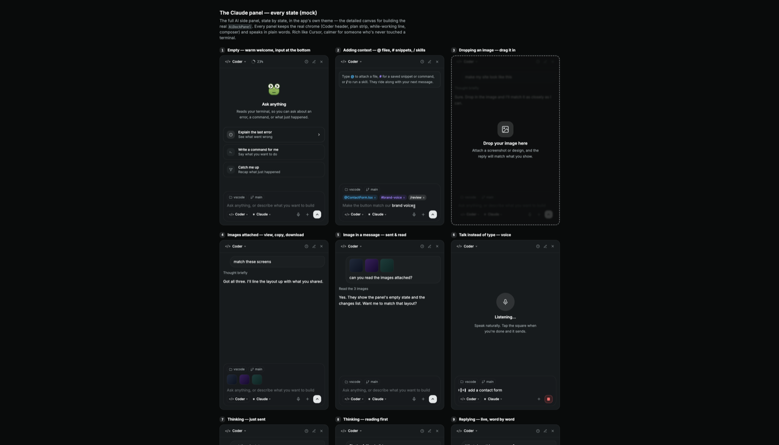
Each state is its own URL (?story=…), so I can deep-link a single screen — the AI panel's every state, the full terminal, the changes panel — to review it, screenshot it, or hand it to someone for feedback, all without booting the whole app.
What it buys me
- Every state designed on purpose — empty, loading, offline, error, conflict — not just the happy path.
- Real components exercised in isolation with seeded data, away from app noise.
- One place to see the entire UI at a glance and track what's still a mock.
- The design rationale lives beside the design, not in a separate document.
This is the un-glamorous half of the work: state by state, in the open, before any of it reaches the app.
More projects
view all →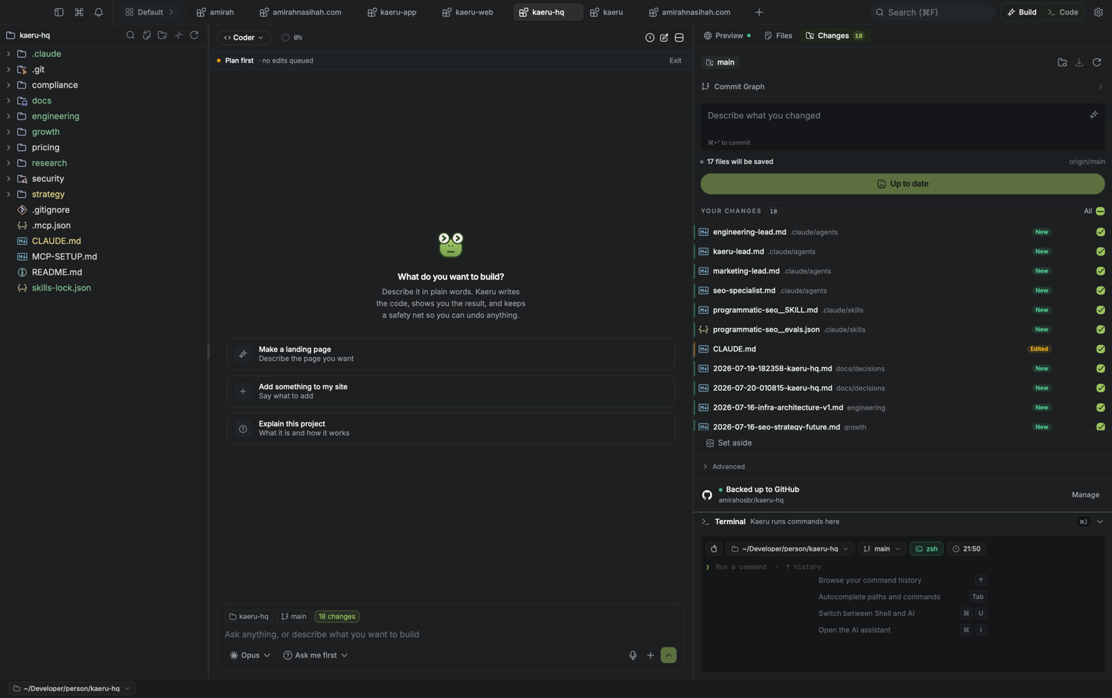
Kaeru Desktop App
A lightweight AI workspace anyone can use: chat with an agent to build and edit, preview your app live, and keep your work safe with plain-language source control. A desktop app built on Tauri + Rust, about 8 MB.
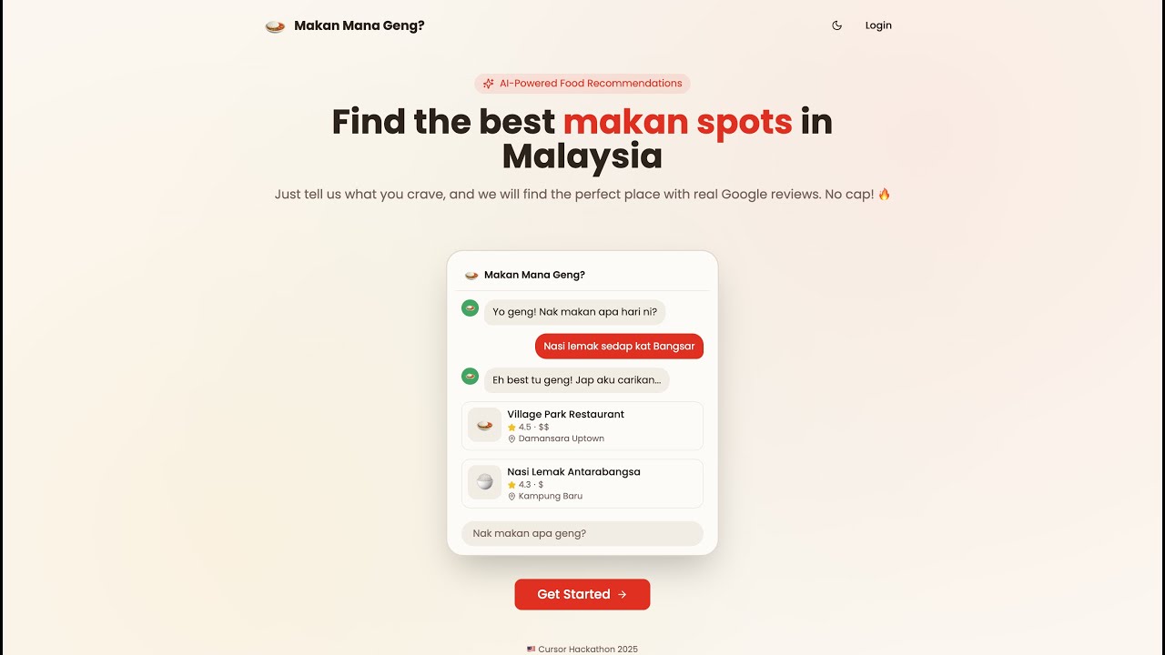
MakanMana
Your AI-powered food plug for the best makan spots in Malaysia. Ask naturally in Manglish and it hooks you up with real places, backed by real Google Maps reviews. Built with Syahirah for Cursor Hackathon 2025.
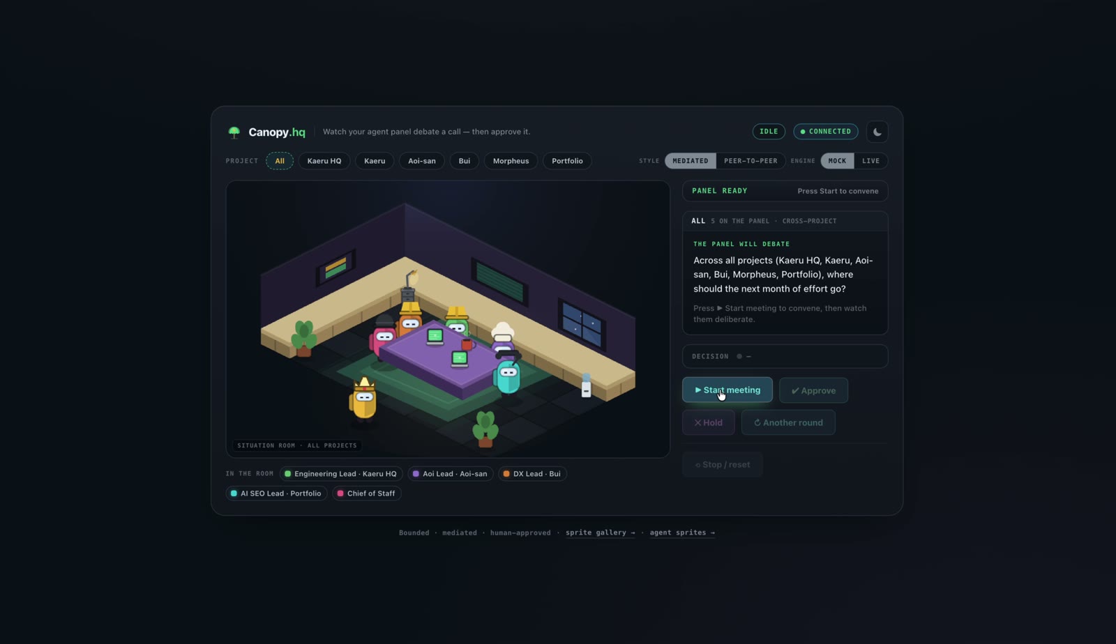
Canopy
An agent situation-room: a panel of AI leads debates a call across your projects, then you approve it. Bounded, mediated, human-approved.